What is alt text and how do you write it?
Alt text is an abbreviation of ‘alternative text’.
It’s used to make digital content more accessible for people with sight loss who use screen readers. It’s about being inclusive in your digital practice – and it ensures even more people can engage with your fabulous content!
You add alt text to images used on websites, apps and social media, and it’s up to the content creator to include it.
As it happens, alt text is also handy for improved SEO (search engine optimisation), as it helps search engines like Google to understand your content better. Plus, if an image won’t load for any reason, web users may be shown the descriptive alt text instead.
So, how does alt text actually work?
If you’re the one making the content, you can add alt text before you publish a page or a post (and, in most cases, you can go back and retrospectively include or edit it after you’ve published).
If you’re creating a website, it’s best to add alt text to your images as you upload them, rather than coming back at the end and adding it. It’ll help you to be aware of the context in which you’re using the image – and save you a whole lot of admin at the end of your website project!
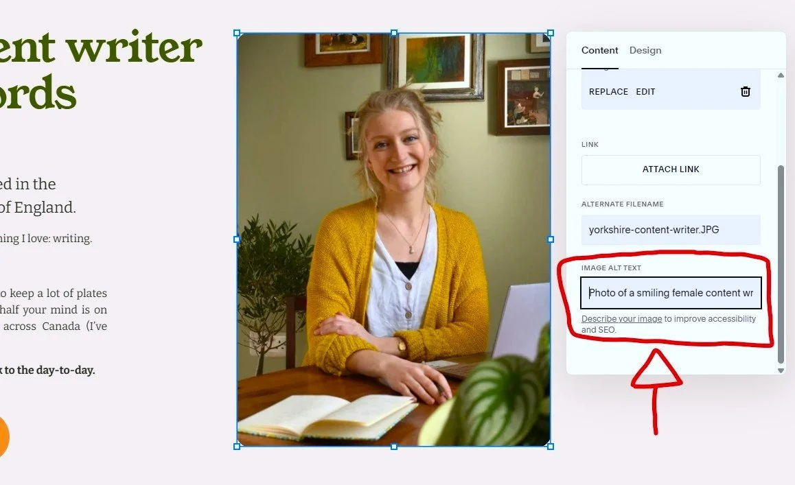
You add alt text to the image itself. This can usually be found in the image’s ‘edit’ section.
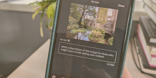
Here’s an example from a website CMS perspective (Squarespace):
And from a social media perspective (LinkedIn):

When you click the alt text button, you’ll find a text box in which you can describe your image – more on that later!
On some social platforms (such as Instagram), you may need to go to ‘more options’ to find the alt text section.
If you’re the one consuming the content, in most cases, you’ll only know the alt text is there if you use a screen reader. This is a downloadable app, which dictates exactly what’s on the page for someone who can’t see it clearly or at all. When the screen reader gets to an image, it’ll read the alt text associated with it (out loud) to describe what the image shows.
Sometimes, alt text is auto generated, but it’s better when it’s written by the content creator. One, because they know which points of the image are most important to describe within its wider context; and two, because auto-generated alt text doesn’t always get it right.
How do you write successful alt text?
The key thing to ask yourself is this: what do you want people to get from this image?
You’ve chosen to use it because it adds something to your content. Perhaps it’s setting the scene, or helping people to understand your topic better. It might add an extra layer to your content – a bit of humour or an emotional element.
Once you’ve worked out why you’ve used a particular image, it’ll make it easier to describe it in a way that’s useful to someone using a screen reader. You can help them to engage with the image in the way you intended.
For example, let’s say you’ve found a photo of a cat looking sinister to accompany your article about why cats are going to take over the world. Alt text that simply says ‘Photo of a cat behind a table’ doesn’t quite do the job.
The better alt text would read, ‘Photo of a tabby cat peering cunningly from behind a grey table.’ The extra details help the user to picture the image in a way that’s relevant to the wider context of the article.
Top tips for writing effective alt text
Here are some other things you’ll want to consider:
What type of image is it? A photo? A graph? An illustration? Make this clear at the start - ie. ‘A cartoon of two birds…’
Does the image have any words in it? If so, include them in your alt text if they’re important.
If it’s a photo of a fish and chip shop that has the sign ‘fish and chips’ above the shop, you wouldn’t need to describe the sign if you’re naming the building as a fish and chip shop anyway.
However, if it’s a photo of a fish and chip shop with a sign that says ‘closed due to lack of chips’, and your article is about a potato scarcity, it’s worth including the writing on the sign so that web users understand the significance of the image.
Don’t forget colours! Help to paint a proper picture of the image by describing key colours. If colour is important in your image, then you get extra points for adding in a shade (for instance, ‘lime green’ rather than ‘green’).
Can you include expressions? If there are people or animals in the image, describing their expression can help to demonstrate what the image is showing. Is it a smiling woman? A snarling lion? A giggling baby?
…but don’t get too detailed. Alt text is often capped at a certain number of characters, so it’s best not to get carried away. Also, the person consuming your content probably doesn’t have all day to listen to your alt text slowly become next year’s Nobel literature prize-winner. Include the important details, but keep things concise and relevant. One or two sentences should be enough.
Some things can be assumed. To keep your alt text concise, it’s okay to assume certain points.
For example, if you’ve written an online guide to growing sunflowers, you don’t need to describe exactly what a sunflower looks like, because it’s very likely your audience already knows. So, you can leave it at ‘Photo of a tall sunflower in a large, bright yellow pot in front of a red brick wall.’
Remember, the main thing is to convey the significance of the image. Two identical images might have different alt text depending on their context, because what makes the image relevant might change.
Alt text vs. image descriptions
Image descriptions are different from alt text and are sometimes used on social media. They’re added after the main post text, often in square brackets and labelled as ‘Image description’. They’re not ‘attached’ to the image, like alt text is; they’re part of the caption.
Because a screen reader (set to English) reads from left to right, top to bottom, this means it will get to the image description last, after it’s read the actual caption.
This isn’t necessarily an issue. On a platform like LinkedIn, the image comes at the bottom of the text anyway. If you’re on Instagram, though, which is all about visuals, you’d probably prefer to know what the image is before you read the caption. In this case, the content creator should definitely use alt text to describe the image.
It’s also worth considering that not everyone who’s visually impaired uses a screen reader.
Somebody might be able to read enlarged text just fine, but struggle to see the finer details of an image. Here, an image description is probably pretty useful, so that the user can get the info they need from the image without having to turn on a screen reader.
Alt text is the standard, go-to option for accessible content, but, if you’re in doubt, adding an image description in the caption of your post as well doesn’t hurt. Someone using a screen reader can skip past this if it’s repeated content.
It’s important to point out that my advice here is a product of what I’ve learnt over my years in marketing and copywriting, conversations I’ve had with colleagues, and discussions on accessibility at professional conferences.
I don’t use a screen reader myself and, once I’ve popped my glasses on or put my contacts in, I have no trouble consuming visual content.
So, if you’re someone with lived experience of sight loss and there’s something I could add or change on this blog, please do drop me a message – I’d love to hear from you!
And, if you’re here because you’re creating a website, I’m just an email away if you decide you’d like a helping hand finding the right words for it (including writing alt text).